Are you ready for another design lesson? Fair warning: the images are intentionally blurry. One element of design is proportion. Proportion is the relationship in scale between one object and another, or between a whole object and one of its parts. The issue here is the relationship between an element and the whole. Does that make any sense to you? I have a perfect example.
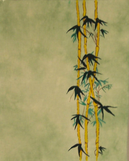
In 1984, I had to do a final project in a design class in college. I, of course, was going to do a quilt. I painted my design on one block. As luck would have it, the block size was 18x22. A fat quarter size long before the term FQ. I only had enough time before the end of term to do one block. The instructor liked the concept and the one block. I got an 'A' in the class. Here's the block. As always, the image is clickable. When I presented this to the instructor it was painted with Deka* fabric paints on unbleached muslin. The color range of the paints was quite limited and I ended up mixing some to get the color I wanted for the lighter leaves. After I graduated, I made 8 more of these blocks and sewed them together into a very large 9-patch. And then set it aside to age.
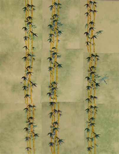
Fast forward about 10 years. I dug this out, hung it on the design wall and studied it. What was it about this that bothered me? I figured it was the color so I overdyed it with green Procion dyes and ended up with this. Better, but I still didn't like it. Back it went to the shelf.
I recently dug it out again and put it back up on the wall. I was not ready to release it yet. I liked it but there was something about it that bothered me. I studied this thing for months until it dawned on me that the scale was off. The scale of each individual block (element) was good for itself but when you put that element with 8 others the scale was too small.
How to fix it? Well, I considered adding more bamboo in a larger size on top of what was there by appliqué. But I didn't really want to go there. My solution? Go back to the first picture. You can see that the block works like that. I took this top apart. I now have 9 mini quilts sized 18x22.
Or, and here is where a program like Photoshop is handy, how about this? Do you know what this is? This is a 4x6" postcard that I cropped out of the 18x22" block. Can you see where the proportion comes into play? The whole quilt was "off". The smaller 'block' works as an individual. But trimming it down even further is the best solution for the scale of the bamboo. And yes, I am going to make some postcards but I am also going to make a triptych. I have many choices.
Was this helpful? Should I continue on more design principles?
*Deka fabric paints are no longer available
Update: I was asked what is a triptych? Wikipedia has an excellent definition. Short and sweet: is 3 panels. I'll do them side by side without hinges *smile*.


((raising hand)) Yes, please Ma'am; I would like more! Great graphic lesson, and good decision. Sometimes the negative space makes the design. I like that idea of a triptec too -- hmmmm....
ReplyDeletePlease continue - BTW That would go perfectly in my living room - I just hung my Asian Trip Around the World, and my Asian Charm Quilt is hanging over the arm chair...
ReplyDeleteYes, please, but keep it simple! this was perfect, photos illustrated your points perfectly!
ReplyDeletethanks, i'm smarter already
btw, what is ia tryptec??
ReplyDeletesee what i mean. I'm simple.:)
What a great solution! I'll have to keep that in mind the next time I dig into the ancient pile of unfinished tops I have ;).
ReplyDeleteThe postcard looks fabulous! What a great idea.
ReplyDeleteI personally would LOVE a refresher in elements of design. I learned all this 25+ years ago in design school, and I've finally lost memory of some of the (is it 7?) elements. Wish I could find my textbook--was it Elements of Design? Keep it up!
ReplyDeleteThat was great to read. Thank you. I alway enjoying learning new things.
ReplyDeleteYes this is a good lesson. Thank you for sharing it, and I'd sign up for the next class!
ReplyDeletei personally LOVE learning from you... so as far as should you keep sharing... YES!!
ReplyDeleteI LOVE yer Krazy sox, mama!! And silk longjohns RULE!!!!
Have a beautiful Saturday!! love yer Sarah Free